
 星风之痕
星风之痕
插件描述
这是一款专为Halo建站系统设计的个人设备可视化展示插件,支持高效管理并呈现用户的设备收藏与使用场景。 该插件配置了Halo FinderAPI,并内置了个人设备页面,用户也可根据Finder API文档自行设计个人设备展示页。
注意事项
本插件为Halo版本,若需使用wordpress版本,推荐大家使用梅林的WP版个人设备插件
https://www.ryanzm.cn/archives/wo-de-she-bei-cha-jian
核心功能
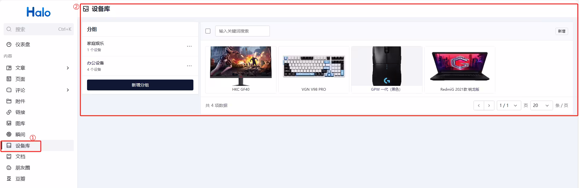
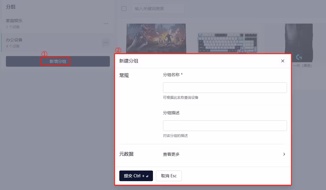
设备分类管理:可自定义分类标题与描述,构建多层级设备展示体系。
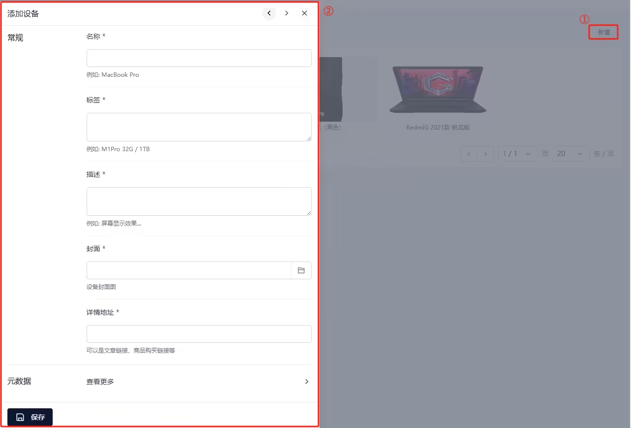
设备详情配置:支持上传设备图片、命名设备名称、添加个性化标签、撰写详细描述,并支持嵌入查看详情链接,可以是文章链接,也可以是商品链接。
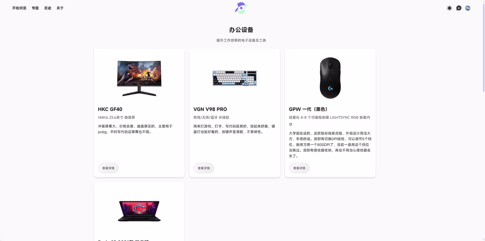
内置个人设备展示页: PC端每行最多3个设备,手机端自动切换为单列显示。
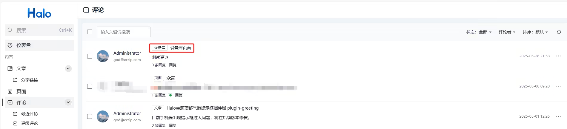
实现了自定义评论主体: 方便收集和展示评论来源。
支持Halo FinderAPI:提供标准数据接口,用户可自主对接API自己实现个人设备展示页。
下载地址
版本:V1.0.0
Github Release下载:访问Release下载 Assets 中的 JAR 文件
https://github.com/springai/halo-plugin-device/releases/tag/V1.0.0
目前最新版本:V1.1.1(此块内容会随版本更新改变)
使用方式
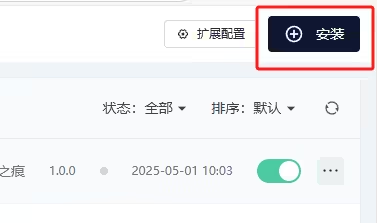
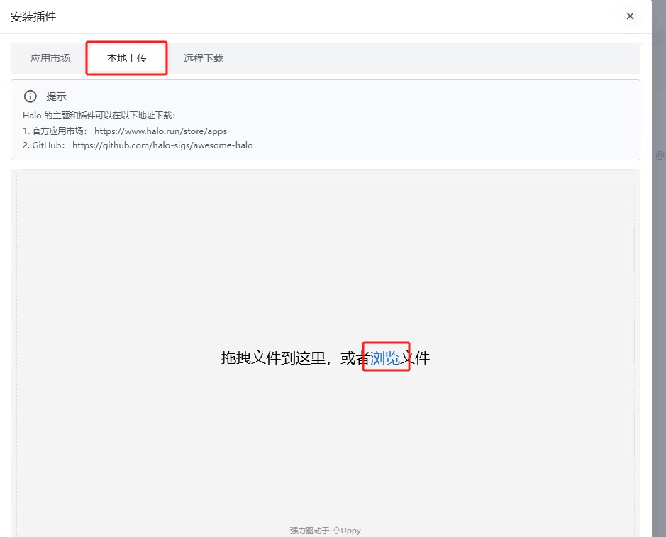
本插件目前暂未上架官方应用市场,仅支持本地上传安装,详细如下:
下载jar包后,进入Halo后台插件页面点击右上角的安装。
进入安装插件页面后,点击本地安装将下载的jar包导入后启动插件即可
功能演示
前端

后台
评论主体
主题适配
路由信息:
模板路径: /templates/devices.html
访问路径:/devices
内置的模板目前是不包含头部和底部组件的,需要用户根据主题去进行适配,调用自己主题的layout组件。用户也可以参考本页最后部分的开发个人设备模板板块,根据提供的Finder API开发适合自己的模板。
以下是适配星度主题的例子,星度用户可直接按照以下内容操作即可:
模板一
演示
代码如下
<!DOCTYPE html>
<html xmlns:th="https://www.thymeleaf.org"
      th:replace="~{modules/layout :: layout(_title = ${title},menu_site_title = ${'正在阅读:'+title},_content = ~{::content},
      _head = ~{::head},page_js = null,body_class = 'page-template page-template-device page')}">
<th:block th:fragment="head">
    <th:block th:replace="~{modules/page-css}"/>
        <style>
        .device-container {
            max-width: 1200px;
            margin: 0 auto;
            padding: 20px;
        }
        .device-title {
            font-size: 24px;
            font-weight: bold;
            margin-bottom: 10px;
            text-align: center;
        }
        .device-subtitle {
            font-size: 14px;
            color: #666;
            margin-bottom: 20px;
            text-align: center;
        }
        .device-product-grid {
            display: flex;
            flex-wrap: wrap;
            gap: 20px;
        }
        .device-product-card {
            width: 100%;
            background-color: #fff;
            border-radius: 10px;
            box-shadow: 0 4px 6px rgba(0, 0, 0, 0.1);
            padding: 15px;
            transition: transform 0.3s ease;
            box-sizing: border-box;
            display: flex;
            flex-direction: column;
        }
        @media (min-width: 768px) {
            .device-product-card {
                width: 356.33px; /* 最小宽度设置为356.33px */
                min-width: 356.33px; /* 防止元素收缩 */
            }
        }
        @media (min-width: 1024px) {
            .device-product-card {
                width: 356.33px; /* 大屏幕时设置为456.56px */
                min-width: 356.33px;
            }
        }
        .device-product-card:hover {
            transform: scale(1.02);
        }
        .device-product-image {
            width: 100%;
            height: 200px;
            object-fit: contain;
            border-radius: 5px;
            background: #ffffff;
        }
        .device-product-title {
            font-size: 18px;
            font-weight: bold;
            margin-top: 10px;
        }
        .device-product-subtitle {
            font-size: 14px;
            color: #666;
            margin-top: 5px;
        }
        .device-product-description {
            font-size: 14px;
            margin-top: 10px;
            line-height: 1.6;
            flex-grow: 1;
        }
        .device-buttons {
            margin-top: auto;
            text-align: left;
            padding-top: 15px;
        }
        .device-details-button {
            display: inline-flex;
            align-items: center;
            gap: 5px;
            font-size: 12px;
            background: linear-gradient(135deg, #f8f9fa 0%, #e9ecef 100%);
            color: #495057;
            padding: 8px 16px;
            border: 1px solid #dee2e6;
            border-radius: 25px;
            cursor: pointer;
            transition: all 0.3s ease;
            position: relative;
            overflow: hidden;
        }
        .device-details-button:hover {
            background: linear-gradient(135deg, #007bff 0%, #0062cc 100%);
            color: #fff;
            border-color: #0056b3;
            box-shadow: 0 4px 15px rgba(0, 123, 255, 0.3);
            transform: translateY(-2px);
        }
        .device-details-button:active {
            transform: translateY(0);
            box-shadow: 0 2px 8px rgba(0, 123, 255, 0.3);
        }
        .device-details-button::after {
            content: '';
            position: absolute;
            top: -50%;
            left: -50%;
            width: 200%;
            height: 200%;
            background: linear-gradient(
                    45deg,
                    transparent 25%,
                    rgba(255, 255, 255, 0.2) 50%,
                    transparent 75%
            );
            transform: rotate(45deg);
            transition: all 0.5s ease;
            opacity: 0;
        }
        .device-details-button:hover::after {
            opacity: 1;
            top: 0;
            left: 0;
        }
    </style>
</th:block>
<th:block th:fragment="content">
    <main id="main" class="site-main" role="main">
<div class="device-container" th:each="group : ${deviceFinder.groupBy()}" >
    <h1 class="device-title" th:text="${group.spec.displayName}"></h1>
    <p class="device-subtitle" th:text="${group.spec.description}"></p>
    <div class="device-product-grid">
        <div class="device-product-card"  th:each="device : ${group.devices}">
            <img class="device-product-image" data-fancybox="gallery" th:src="${device.spec.cover}" th:alt="${device.spec.displayName}">
            <h2 class="device-product-title" th:text="${device.spec.displayName}"></h2>
            <p class="device-product-subtitle" th:text="${device.spec.label}"></p>
            <p class="device-product-description" th:text="${device.spec.description}"></p>
            <div class="device-buttons">
                <a th:href="${#strings.startsWith(device.spec.url, 'http://')
        || #strings.startsWith(device.spec.url, 'https://')
            ? device.spec.url
            : 'http://' + device.spec.url}"
                   class="device-details-button">查看详情</a>
            </div>
        </div>
    </div>
</div>

        <th:block th:if="${haloCommentEnabled}">
            <th:block th:replace="~{modules/widgets/comment :: comment(post_name='plugin-device-comment',kind='DeviceComment',group='core.erzip.com')}"></th:block>
        </th:block>
    </main>
</th:block>
</html>
模板二
演示
代码如下
<!DOCTYPE html>
<html xmlns:th="https://www.thymeleaf.org"
      th:replace="~{modules/layout :: layout(_title = ${title},menu_site_title = ${'正在阅读:'+title},_content = ~{::content},
      _head = ~{::head},page_js = null,body_class = 'page-template page-template-gallery page wide-page')}">
<th:block th:fragment="head">
    <th:block th:replace="~{modules/page-css}"/>
    <style>
        .device-container {
            max-width: 1200px;
            margin: 0 auto;
            padding: 20px;
        }
        .device-title {
            font-size: 24px;
            font-weight: bold;
            margin-bottom: 10px;
            text-align: center;
        }
        .device-subtitle {
            font-size: 14px;
            color: #666;
            margin-bottom: 20px;
            text-align: center;
        }
        .device-product-grid {
            display: flex;
            flex-wrap: wrap;
            gap: 20px;
        }
        .device-product-card {
            width: 100%;
            background-color: #fff;
            border-radius: 10px;
            box-shadow: 0 4px 6px rgba(0, 0, 0, 0.1);
            padding: 15px;
            transition: transform 0.3s ease;
            box-sizing: border-box;
            display: flex;
            flex-direction: column;
        }
        @media (min-width: 768px) {
            .device-product-card {
                width: 356.33px; /* 最小宽度设置为356.33px */
                min-width: 356.33px; /* 防止元素收缩 */
            }
        }
        @media (min-width: 1024px) {
            .device-product-card {
                width: 356.33px; /* 大屏幕时设置为456.56px */
                min-width: 356.33px;
            }
        }
        .device-product-card:hover {
            transform: scale(1.02);
        }
        .device-product-image {
            width: 100%;
            height: 200px;
            object-fit: contain;
            border-radius: 5px;
            background: #ffffff;
        }
        .device-product-title {
            font-size: 18px;
            font-weight: bold;
            margin-top: 10px;
        }
        .device-product-subtitle {
            font-size: 14px;
            color: #666;
            margin-top: 5px;
        }
        .device-product-description {
            font-size: 14px;
            margin-top: 10px;
            line-height: 1.6;
            flex-grow: 1;
        }
        .device-buttons {
            margin-top: auto;
            text-align: left;
            padding-top: 15px;
        }
        .device-details-button {
            display: inline-flex;
            align-items: center;
            gap: 5px;
            font-size: 12px;
            background: linear-gradient(135deg, #f8f9fa 0%, #e9ecef 100%);
            color: #495057;
            padding: 8px 16px;
            border: 1px solid #dee2e6;
            border-radius: 25px;
            cursor: pointer;
            transition: all 0.3s ease;
            position: relative;
            overflow: hidden;
        }
        .device-details-button:hover {
            background: linear-gradient(135deg, #007bff 0%, #0062cc 100%);
            color: #fff;
            border-color: #0056b3;
            box-shadow: 0 4px 15px rgba(0, 123, 255, 0.3);
            transform: translateY(-2px);
        }
        .device-details-button:active {
            transform: translateY(0);
            box-shadow: 0 2px 8px rgba(0, 123, 255, 0.3);
        }
        .device-details-button::after {
            content: '';
            position: absolute;
            top: -50%;
            left: -50%;
            width: 200%;
            height: 200%;
            background: linear-gradient(
                    45deg,
                    transparent 25%,
                    rgba(255, 255, 255, 0.2) 50%,
                    transparent 75%
            );
            transform: rotate(45deg);
            transition: all 0.5s ease;
            opacity: 0;
        }
        .device-details-button:hover::after {
            opacity: 1;
            top: 0;
            left: 0;
        }
    </style>
</th:block>
<th:block th:fragment="content">
    <main id="main" class="site-main" role="main">
        <header class="page-header">
            <th:block th:with="groupSpec=${#strings.isEmpty(param.group) ? null : deviceFinder.groupBy(param.group).spec}">
                <h1 class="page-title fade-before">
                    <span th:text="${#strings.isEmpty(param.group) ? '全部' : groupSpec.displayName}"></span>
                </h1>
                <div class="taxonomy-des fade-before">
                    <p th:text="${#strings.isEmpty(param.group) ? '' : groupSpec.description}"></p>
                </div>
            </th:block>
            <nav class="taxonomy-nav fade-before">
                <ul class="taxonomy-sub no-scrollbar">
                    <li class="cat-item" th:classappend="${#strings.isEmpty(param.group) ? 'current-cat' : ''}">
                        <a th:href="@{/devices}">全部</a>
                    </li>
                    <th:block th:each="group : ${deviceFinder.groupBy()}">
                        <li class="cat-item" th:classappend="${#strings.equals(param.group, group.metadata.name) ? 'current-cat' : ''}">
                            <a th:href="@{|/devices?group=${group.metadata.name}|}"
                               th:text="${group.spec.displayName}"></a>
                        </li>
                    </th:block>
                </ul>
            </nav>
        </header>
        <article class="page-article gallery">
            <th:block th:each="device : ${devices.items}">
                <div class="device-product-card">
                    <img class="device-product-image" data-fancybox="gallery" th:src="${device.spec.cover}" th:alt="${device.spec.displayName}">
                    <h2 class="device-product-title" th:text="${device.spec.displayName}"></h2>
                    <p class="device-product-subtitle" th:text="${device.spec.label}"></p>
                    <p class="device-product-description" th:text="${device.spec.description}"></p>
                    <div class="device-buttons">
                        <a th:href="${#strings.startsWith(device.spec.url, 'http://')
        || #strings.startsWith(device.spec.url, 'https://')
            ? device.spec.url
            : 'http://' + device.spec.url}"
                           class="device-details-button">查看详情</a>
                    </div>
                </div>
            </th:block>
        </article>
        <th:block th:with="param_group = ${not #strings.isEmpty(param.group) ? '?group='+param.group : ''},path = '/devices'">
            <nav th:if="${devices.totalPages > 1}" class="navigation page-navigation" role="navigation">
                <a class="prev page-numbers" th:if="${devices.hasPrevious}" th:href="@{${devices.prevUrl}}">
                    <button class="button prev has-thyuu-color has-btn-effect">
                        <span class="btn-meta">上一页</span>
                    </button>
                </a>
                <th:block th:if="${devices.page > 2}">
                    <a class="page-numbers" th:href="${path+'/page/1'+param_group}">1</a>
                    <span class="page-numbers dots" th:if="${devices.page != 3}">…</span>
                </th:block>
                <th:block th:each="index:${#numbers.sequence(devices.page-1,devices.page+1)}">
                    <span aria-current="page" class="page-numbers current" th:if="${devices.page} == ${index}"
                          th:text="${devices.page}"></span>
                    <a th:unless="${devices.page == index}" th:if="${index > 0 && index <= devices.totalPages}"
                       class="page-numbers" th:href="${path+'/page/'+index+param_group}" th:text="${index}"></a>
                </th:block>
                <th:block th:if="${devices.totalPages - devices.page >= 2}">
                    <span class="page-numbers dots" th:if="${devices.totalPages - devices.page != 2}">…</span>
                    <a class="page-numbers" th:href="${path+'/page/'+devices.totalPages+param_group}"
                       th:text="${devices.totalPages}"></a>
                </th:block>
                <a class="next page-numbers" th:if="${devices.hasNext}" th:href="@{${devices.nextUrl}}">
                    <button class="button next has-thyuu-color has-btn-effect">
                        <span class="btn-meta">下一页</span>
                    </button>
                </a>
            </nav>
        </th:block>
        <th:block th:if="${haloCommentEnabled}">
            <th:block th:replace="~{modules/widgets/comment :: comment(post_name='plugin-device-comment',kind='DeviceComment',group='core.erzip.com')}"></th:block>
        </th:block>
    </main>
</th:block>
</html>
部分主题适配代码由麻瓜星提供,感谢麻瓜星的支持:
使用方式
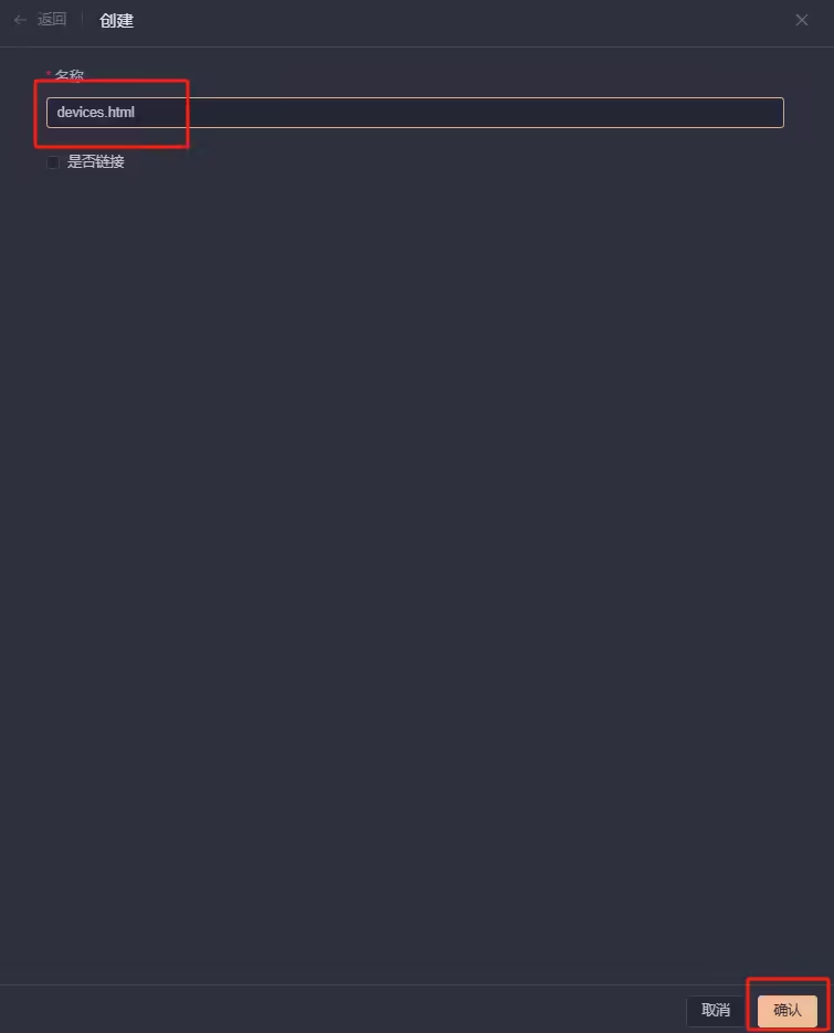
星度用户只需在主题的/templates/目录下新建立一个devices.html,将上面代码粘贴进去(上面提供了两个模板,星度用户根据自己喜好选择即可),如下图所示:
进入主题的/templates/目录下
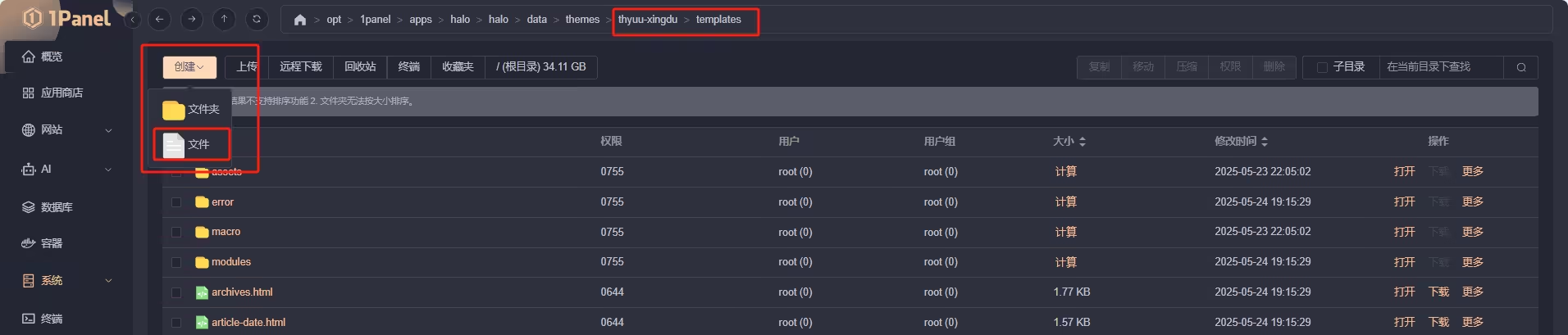
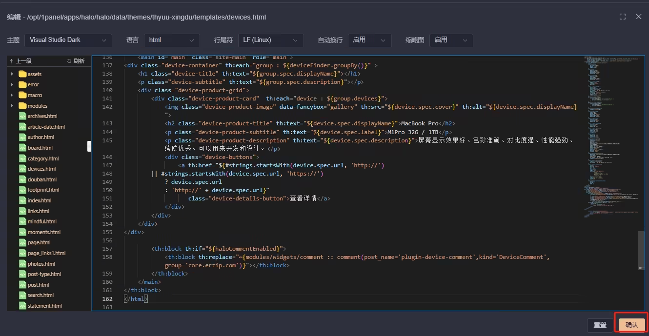
创建名为devices.html
将上面的代码复制进去并保存
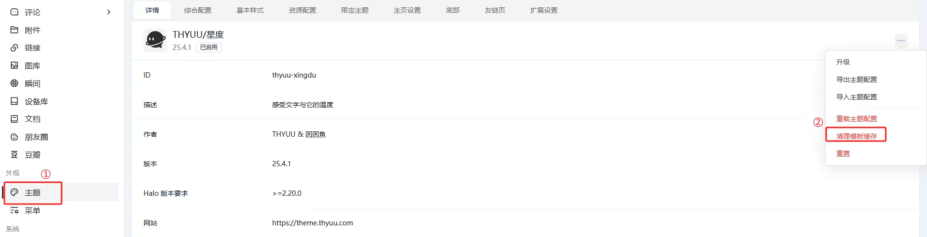
最后进入网站后台管理,清理模板缓存即可
开发个人设备模板助手
类型定义
DeviceVo
{
    "metadata": {
        "name": "string",                                   // 唯一标识
        "labels": {
            "additionalProp1": "string"
        },
        "annotations": {
            "additionalProp1": "string"
        },
        "creationTimestamp": "2025-05-25T09:48:11.115504917Z"   // 创建时间
    },
    "spec": {
        "displayName": "string",                            // 设备名称
        "label": "string",                                  // 设备标签
        "description": "string",                            // 设备描述
        "cover": "string",                                  // 详情链接
        "url": "string",                                    // 设备封面图片
        "priority": 0,                                      // 优先级
        "groupName": "string"                             // 分组名称,对应分组 metadata.name
    }
}
DeviceGroupVo
{
  "metadata": {
    "name": "string",                                   // 唯一标识
    "labels": {
      "additionalProp1": "string"
    },
    "annotations": {
      "additionalProp1": "string"
    },
    "creationTimestamp": "2025-05-25T09:45:44.978360237Z"    // 创建时间
  },
  "spec": {
    "displayName": "string",                            // 分组名称
    "description": "string",                            // 分组描述
    "priority": 0                                    // 分组优先级
  },
  "status": {
    "deviceCount": 0                                    // 分组下设备数量
  },
  "devices": "List<#DeviceVo>"                           // 分组下所有设备列表
}
DeviceComment
{
    "apiVersion": "core.erzip.com/v1alpha1",
    "kind": "DeviceComment",
    "metadata": {
        "name": "plugin-device-comment",                                   // 唯一标识
        "labels": {
            "plugin.halo.run/plugin-name": "plugin-device-comment"
        },
        "version": 0,
        "creationTimestamp": "2025-05-25T10:49:07.927867444Z"    // 创建时间
    }
}
Finder API
groupBy()
描述
获取全部分组列表
参数
无
返回值
List<#DeviceGroupVo>
<div class="device-container" th:each="group : ${deviceFinder.groupBy()}" >
    <h1 class="device-title" th:text="${group.spec.displayName}"></h1>
    <p class="device-subtitle" th:text="${group.spec.description}"></p>
    <div class="device-product-grid">
        <div class="device-product-card"  th:each="device : ${group.devices}">
            <img class="device-product-image" data-fancybox="gallery" th:src="${device.spec.cover}" th:alt="${device.spec.displayName}">
            <h2 class="device-product-title" th:text="${device.spec.displayName}"></h2>
            <p class="device-product-subtitle" th:text="${device.spec.label}"></p>
            <p class="device-product-description" th:text="${device.spec.description}"></p>
            <div class="device-buttons">
                <a th:href="${#strings.startsWith(device.spec.url, 'http://')
        || #strings.startsWith(device.spec.url, 'https://')
            ? device.spec.url
            : 'http://' + device.spec.url}"
                   class="device-details-button">查看详情</a>
            </div>
        </div>
    </div>
</div>
listAll()
描述
获取全部设备内容
参数
无
返回值
List<#DeviceVo>
示例
<ul>
    <li th:each="device : ${deviceFinder.listAll()}">
        <img th:src="${device.spec.url}" th:alt="${device.spec.displayName}" width="280">
        <h2 th:text="${device.spec.displayName}"></h2>
        <p th:text="${device.spec.description}"></p>
        <p th:text="${device.spec.label}"></p>
        <a th:href="${device.spec.url}">查看详情</a>
    </li>
</ul>
listBy(group)
描述
根据分组获取设备列表
参数
group: string - 设备分组名称, 对应 DeviceGroupVo.metadata.name
返回值
List<#DeviceVo>
示例
<ul>
    <li th:each="device : ${deviceFinder.listBy('device-group-05lytpbm')}">
        <img th:src="${device.spec.url}" th:alt="${device.spec.displayName}" width="280">
        <h2 th:text="${device.spec.displayName}"></h2>
        <p th:text="${device.spec.description}"></p>
        <p th:text="${device.spec.label}"></p>
        <a th:href="${device.spec.url}">查看详情</a>
    </li>
</ul>
自定义评论主体
描述
后台自定义评论主体
示例
<div th:if="${haloCommentEnabled}">
    <halo:comment
            group="core.erzip.com"
            kind="DeviceComment"
            name="plugin-device-comment"
    />
</div>